
 |
| Are you ready for the most viewed links from last weeks Treasure Hunt Thursday? |
 |
| 1. Gwen Moss- Beautiful Kitchen |
 |
| 2. Market Nine Home- Rotating Accessories |
 |
| 3. Looks Like White- Shared beach Home |
Thank you ladies for coming to the party!
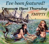
While I have everybody here I am taking a poll. This is y'alls party so I thought that I would get your input on a possible update. Over the past few weeks I have been making a few new buttons with thoughts of possibly using a new button for Treasure Hunt Thursday.
 |
| Option A This is the original button that we all know and recognize. |
 |
| Option B This is a beautiful bird graphic that I found over on The Graphics Fairy site. I liked it because birds are always hunting and gathering for their nests. |
 |
| Option C Then there is this one which matches the rest of my blog buttons. So which button do you prefer? Which ever one gets the most votes wins! I will post the winner during next weeks Most Viewed Links!:) Just leave me your vote in the comments section. Hope everybody is having a great week! |
My vote is for Option C. Option B is very beautiful but it is hard to read the blog name among the "waves". Thank you so much for hosting every week...I love to come "par tay" here! Hugs, Penny
ReplyDeleteBeautiful features!Wow that is a tough one since they are all so pretty but I am going to pick C .
ReplyDeletexx
Anne
I vote for C. Classy. Readable. Nice.
ReplyDeleteMarcia
ReplyDeleteThey are are beautiful, but I love the graphic design of C.
ReplyDeleteHi Pamela, wow, what a nice surprise to see my kitchen featured. Let's see, I do love the bird image although the words are hard to read. So even though I like the 'nesting' visual of B, I would have to vote for C. It' a classic look.
ReplyDeleteLeslie (Gwen Moss)
I love b but I think c is the better option
ReplyDeleteI have to go with the majority so far and say C. Easy to read.
ReplyDeleteKris
I'm such a bird lover...gotta go with B.
ReplyDeleteHi Pamela! I vote for C, as it has the same elements as your header, which I believe is important when it comes to name recognition. And... I am so excited that my Accessory Tips post made your most viewed list! Thanks! ~Kristie
ReplyDeleteI love B, but C is so much easier to read, and as each year passes....I like that more and more!
ReplyDeleteI pick c. They are all pretty but c is bigger and more readable.
ReplyDeleteThe last button is so much more readable and it identifies with your blog so much more. Love that kitchen photo- off to see it in its entirety. :-) Sue
ReplyDeleteHi Pam...
ReplyDeleteAll are very pretty but I am a lover of the classic look so my vote is for C. I agree with Sue...it identifies your blog very well. If I saw it somewhere else I would know in an instant it was your blog. Mmmmm....I think I need to rethink my button now!
Have a great week!
XO Barbara
I have to agree with C. I love the birds in B, but C is clearer and does identify with your blog.
ReplyDeleteI love the bird but I also really really like the one matching your blog. I think I'd go with that one!
ReplyDeleteMy choice would also be with C, because it identifies it with your site. It's always nice to be able to recognize each Blog by their buttons and this one is so you!!
ReplyDeleteI'd have to agree with the majority and say C! Very classic and simple to read!
ReplyDeleteWow! Beautiful features. What talent your partygoers all have. Blessings, Patti
ReplyDeleteLove the bird - it is one of my favorite graphic images to use, but I vote for C - it is beautiful and classy!
ReplyDelete